

MAPS show how the rate of coronavirus in Bracknell Forest has changed over lockdown.
The interactive data, which is part of the government's Covid dashboard, reveals where the positive cases have been in the borough since August.
On the map, lighter colours like white, yellow and green, show low infection rates per 100,000 people while blue and purple colours show the highest rates of infection.
READ MORE: 10 sought after Berkshire areas to move to in 2021
MSOA rate
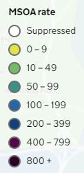
The country was put into the third lockdown on January 4 - with pupils going back to the classroom for just one day before Boris Johnson announced the stricter restrictions.
At the time, Bracknell Forest was in another peak with areas like Central Bracknell & Wildridings recording 111 positive cases and Bullbrook on 93 in just seven-days.
Covid lockdown
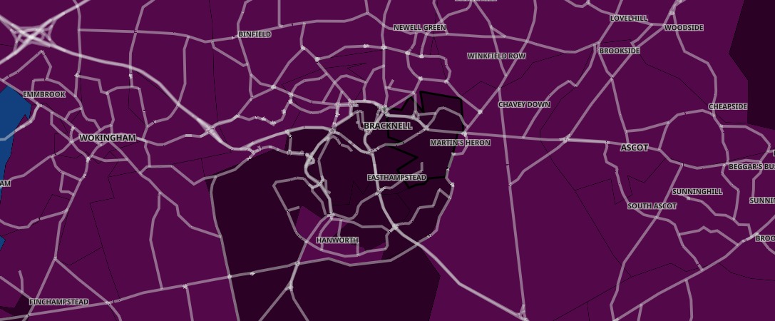
This map (below) shows how cases had changed by February 2 - nearly a month on from Lockdown.
Covid map - February 2
The graphic shows how infection rates in nearly every part of Bracknell Forest dropped significantly with the borough displaying as a sea of blue instead of purple.
ALSO READ: The six men all Berkshire women should avoid
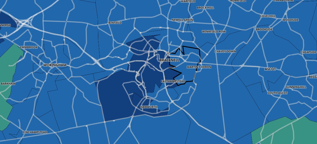
By March 1 (graphic below) more areas in Bracknell Forest suppressed the virus with the map now showing more white areas (less than three cases).
Covid cases by March 1
This slider compares the rates in the seven days up to January 4 (left) to the seven days to March 16 (right) - the latest data available.


Comments: Our rules
We want our comments to be a lively and valuable part of our community - a place where readers can debate and engage with the most important local issues. The ability to comment on our stories is a privilege, not a right, however, and that privilege may be withdrawn if it is abused or misused.
Please report any comments that break our rules.
Read the rules here